Panta Rhea
Bringing a family foundation’s vision to life with a new brand identity rooted in the Indigenous cultures of Latin America and the Caribbean.
Summary
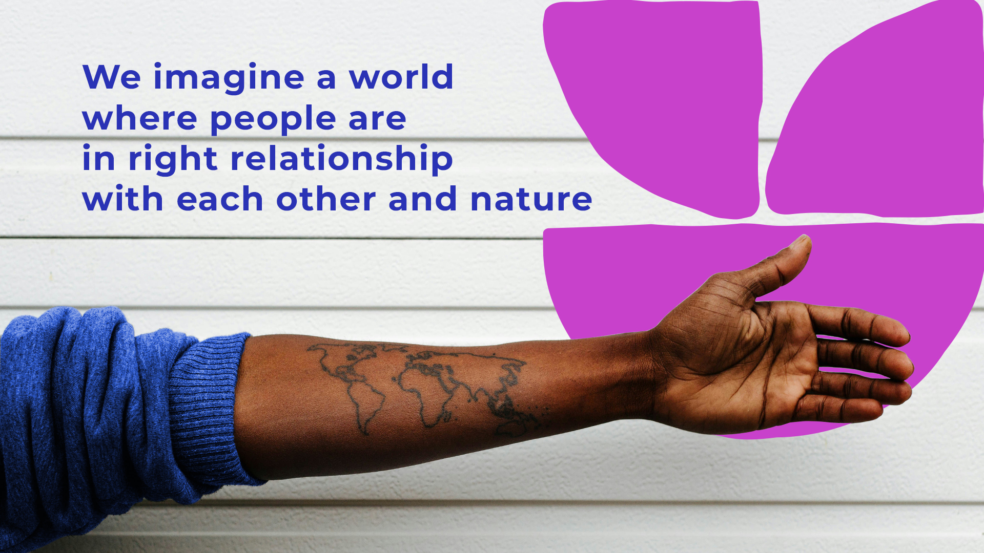
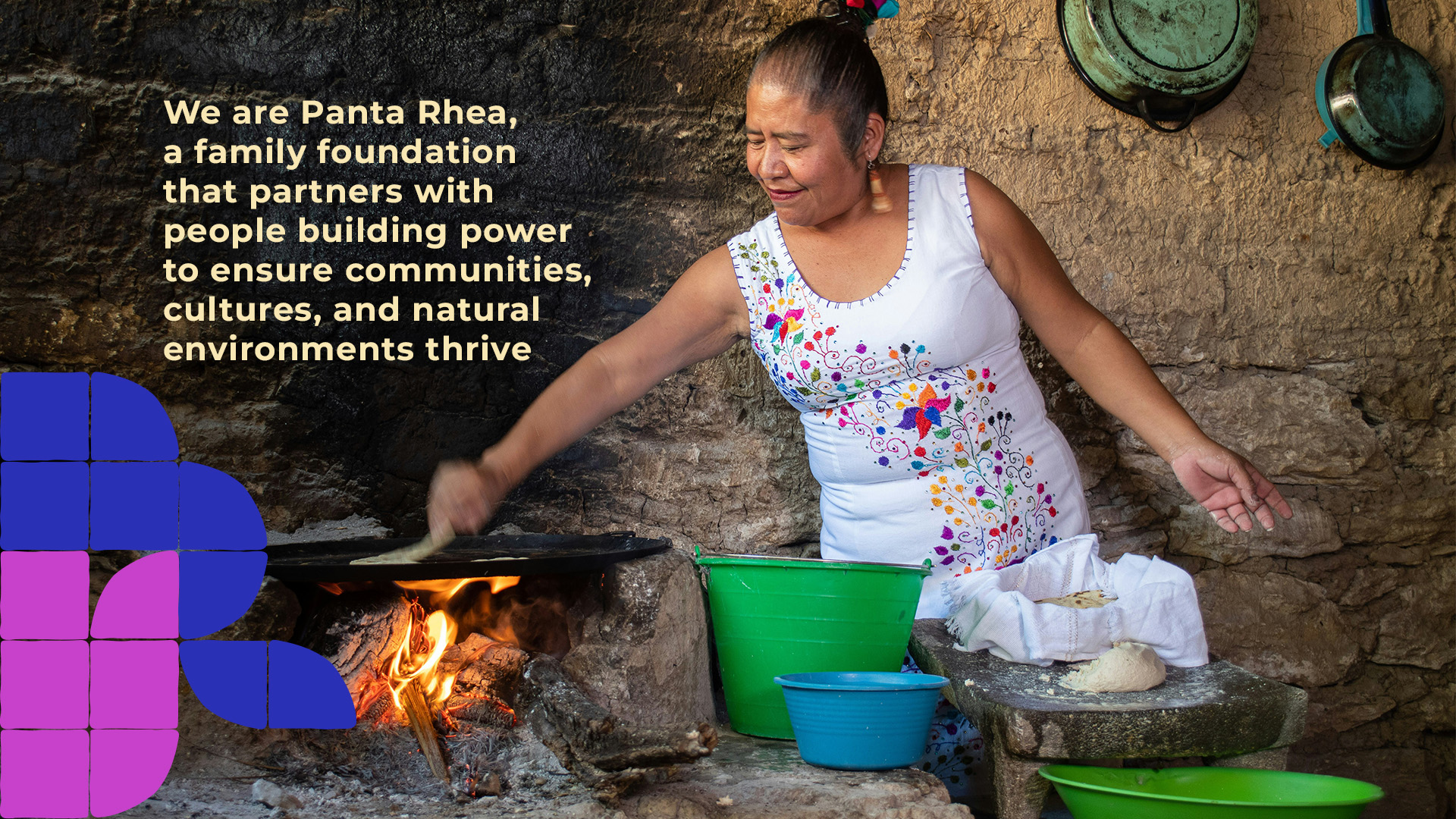
Panta Rhea is a family foundation that supports people building power, honoring culture, and regenerating nature across the Caribbean and Americas. AGO worked closely with their team to create a vibrant brand story and identity to launch their new vision.
What we did
Research & insights
Strategy
Stakeholder engagement
Brand design
Messaging guidelines
Content strategy
A family foundation looks to the future
“I was deeply influenced by the concept of reciprocity in the Andes, and how it could be applied to the redistribution of wealth and power,” she says. “It was a vision of an embodied, creative, and inclusive philanthropy working towards social justice and ecological sustainability."
In the years that followed, Shoepflin began to move the organization closer to this vision. Panta Rhea brought on non-family board members, and hired a diverse staff team with roots across Latin America and the Caribbean.
By 2024, the new strategic vision was ready to launch. But the organization had outgrown its brand.
Where they began, and where they’re going
We began by interviewing 12 different stakeholders—including board members, team members, and grantee partners—to gain a clear picture of Panta Rhea and the relationships it has with the communities and grassroots organizations it supports.
We learned that, unlike other organizations, Panta Rhea needed a brand voice and visual identity that made its partners—not itself—the hero of the story. An intriguing challenge.
A new voice for a new vision
Working closely with the Panta Rhea team, AGO developed a new language around their mission, vision, values, and work. The first goal was to invite people in—to tell the Panta Rhea story in a way that was easy to understand. The second was to talk about the work without any alienating academic language or social justice jargon.
“Understanding the nuanced relationship between Panta Rhea and their regional partners was central to the work we did on brand voice and messaging,” said Gillian O’Neill, Executive Director of AGO. “Foundationally, the work they fund is about nature, people, and culture, so we started there.”
“Understanding the nuanced relationship between Panta Rhea and their regional partners was central to the work we did on brand voice and messaging. Foundationally, the work they fund is about nature, people, and culture, so we started there.””
Gillian O’Neill - Executive Director of AGO
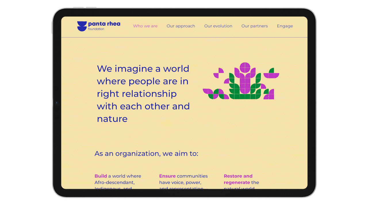
A visual identity rooted in the Indigenous cultures of Latin America and the Caribbean
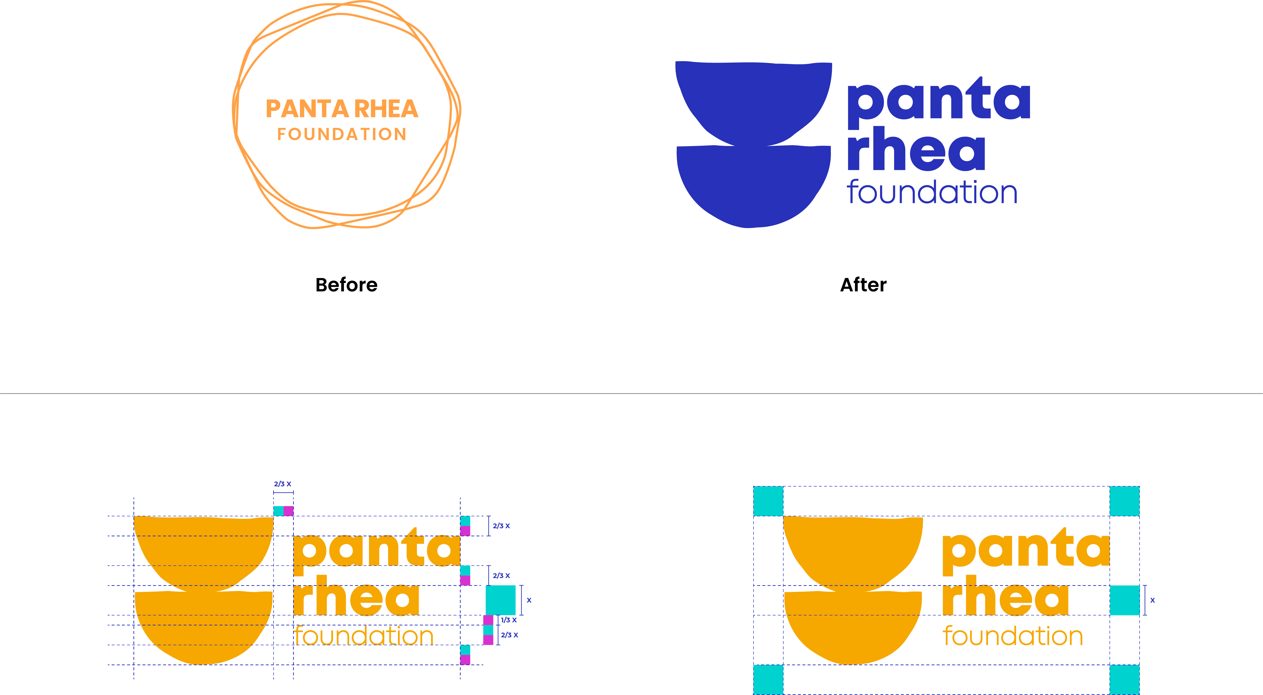
The unity vessels also served as a fundamental inspiration for the rest of the visual identity. By deconstructing the bowls into separate, simple shapes, we were able to create a modular visual language whose individual elements can be recombined and adapted into an infinite number of graphic elements while maintaining a consistent, unified aesthetic.
The vibrant color palette was chosen with a decisive sense of place—Inca Gold, Desert Sand, Terracotta Earth, Caribbean Blue, Fiesta Fuchsia, Tropical Aqua, Andean Violet, and Amazon Green.
Finally, we chose a Montserrat typeface for the Panta Rhea to balance the handcrafted, organic elements with a more formal, contemporary aesthetic.